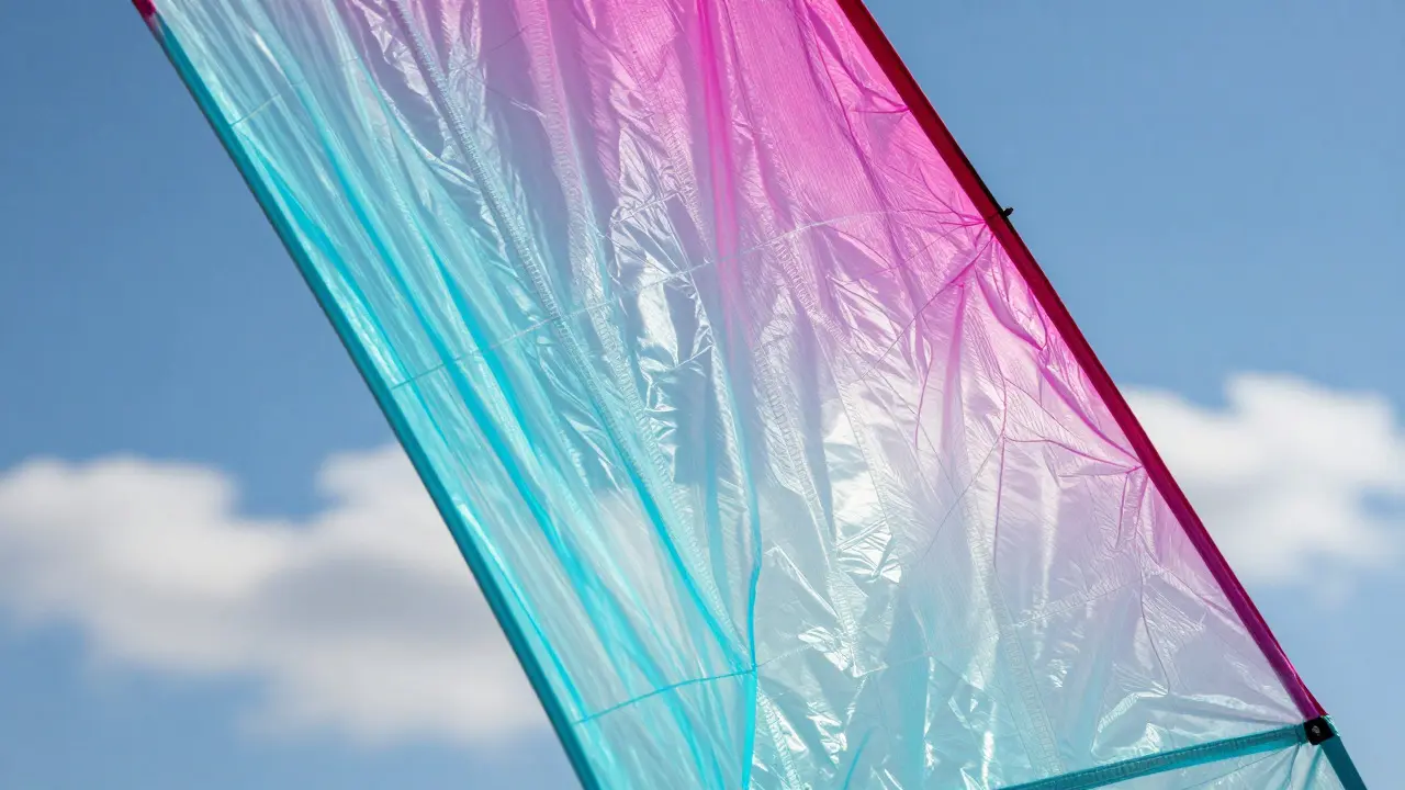
There is a specific moment when an art kite catches the sun that changes everything. The colors don't just sit on the surface; they glow from within. This effect isn't magic-it's physics. It comes down to how light passes through the material you choose. If you are building or painting kites, understanding light transmission is the difference between a flat decoration and a living piece of aerial art.
Most beginners start with whatever fabric is cheap at the craft store. They buy standard cotton or heavy polyester, print on it, and fly it. Then they wonder why it looks dull in bright daylight. The problem is opacity. Thick fabrics block light, forcing the eye to see only the surface layer. Thin, translucent fabrics allow photons to penetrate the material, scatter off the fibers, and exit on the other side. This internal scattering creates depth and vibrancy that no amount of paint can replicate on a thick canvas.
The Physics of Glow: Why Transparency Matters
To understand why certain materials work better than others, you have to look at how light interacts with fiber structures. When white light hits a semi-transparent textile, some wavelengths are absorbed, some are reflected, and some are transmitted. For art kites, we want high transmission. This allows the ambient light-whether it's the harsh midday sun or the soft golden hour-to pass through the colored layers.
Think of it like a stained-glass window. A solid red pane blocks all but red light. A thin, dyed silk pane lets the sunlight through, mixing with the environment. In kite flying, the sky is your backlight. If your fabric is too opaque, you lose that backlighting effect. The colors become static. If the fabric is too thin, the structure fails under wind load. You need a sweet spot where the material is strong enough to hold its shape but thin enough to let light dance through the weave.
Fabric Selection: The Big Three
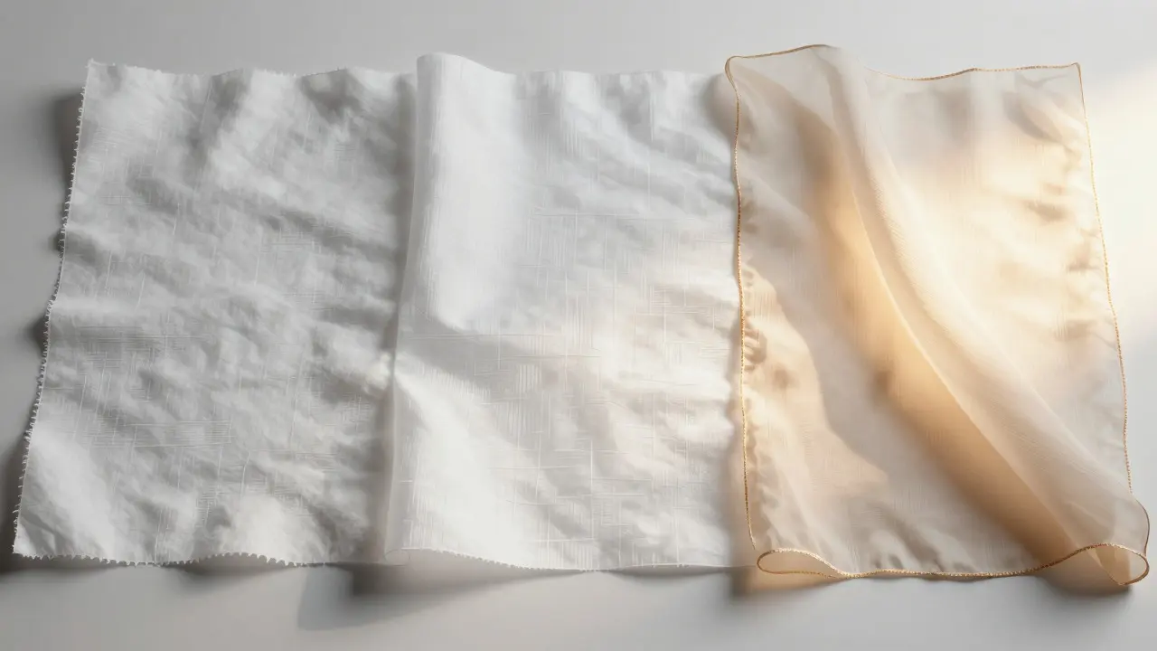
You have three main options when selecting textiles for art kites. Each has distinct advantages depending on your skill level, budget, and desired aesthetic.
- Ripstop Nylon: This is the go-to for most serious builders. It resists tearing, which is crucial when a kite gets caught in a tree or snagged on power lines. The weave is tight, providing a smooth surface for printing. However, it can be slippery to handle during assembly. Prices typically range from $5 to $15 per yard depending on thickness and quality.
- Polyester (Poly-Taffeta): Slightly heavier than nylon, polyester holds its shape better in gusty winds. It has less stretch, which makes structural accuracy easier. It is also more resistant to UV degradation over time. If you plan to keep your kite for several seasons, polyester might outlast nylon. It tends to be slightly more opaque than equivalent-weight nylon, reducing the "glow" factor slightly.
- Silk or Chiffon: These natural or fine synthetic blends offer the highest light transmission. They create a dreamy, ethereal look that synthetic fabrics struggle to match. However, they are fragile. Silk requires careful handling, and chiffon can tear easily if not reinforced. These are best for small, decorative kites flown in calm conditions rather than large, aggressive designs.
When choosing, consider the size of your kite. A 6-foot kite needs more structural integrity than a 2-foot one. For larger frames, stick to 15-20 denier ripstop nylon. For smaller, intricate pieces, you can drop to 10 denier or even use silk for maximum transparency.
Ink Technologies: Sublimation vs. Screen Printing
Choosing the right fabric is only half the battle. The ink must bond correctly with the fibers to survive wind, rain, and UV exposure. Two methods dominate the art kite world: dye sublimation and screen printing.
Dye sublimation is the preferred method for detailed, photo-realistic art. In this process, heat presses turn solid dye into gas, which then bonds directly with the polymer fibers of nylon or polyester. There is no layer of ink sitting on top of the fabric. The color becomes part of the material itself. This results in incredible color vibrancy and zero texture. The downside? You need specialized equipment. A sublimation printer, transfer paper, and a heat press are mandatory. If you don't own these, you can send files to a local print shop, but expect to pay $20-$40 per square foot.
Screen printing, on the other hand, uses plastisol or water-based inks applied through a mesh stencil. This method is cheaper for large, simple shapes but lacks the fine detail of sublimation. Plastisol inks cure hard and can crack if the kite flexes too much. Water-based inks are softer and more flexible, but they require careful drying times. Screen printing is best for bold, graphic designs with limited color counts. It doesn't work well on dark fabrics unless you use a white underbase, which adds opacity and reduces light transmission.
| Feature | Dye Sublimation | Screen Printing |
|---|---|---|
| Detail Level | High (photo-realistic) | Low to Medium (bold shapes) |
| Flexibility | Excellent (dye bonds to fiber) | Moderate (ink sits on surface) |
| Cost per Unit | High ($20-$40/sq ft) | Low ($5-$15/sq ft) |
| Equipment Needed | Heat press, sublimation printer | Screen frames, squeegees, curing oven |
| Light Transmission Impact | Minimal (transparent dyes available) | High (opaque inks block light) |
If light transmission is your priority, sublimation wins hands down. You can use transparent or semi-transparent dyes that allow light to pass through the colored areas. Screen printing forces you to use opaque pigments, which act as barriers to light.
Optimizing Light Transmission in Design
Even with the perfect fabric and ink, bad design choices can kill the glow effect. Here is how to optimize your artwork for maximum visual impact.
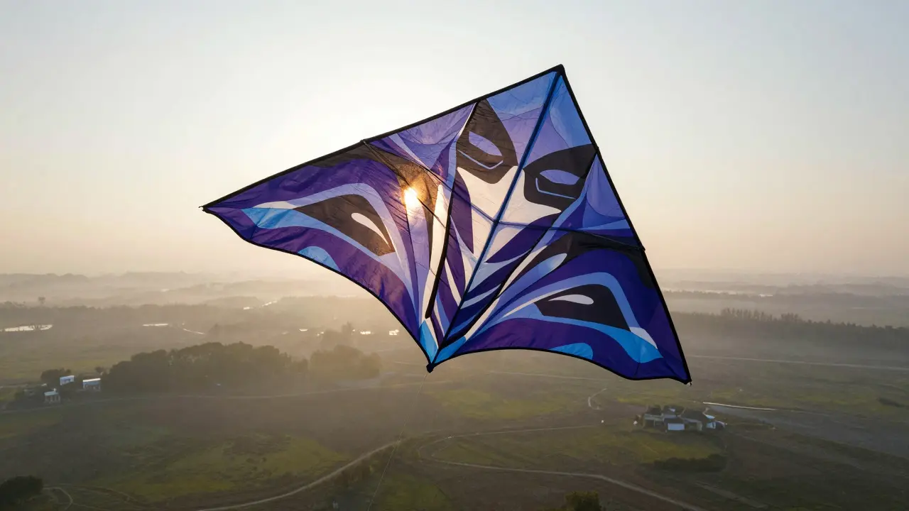
- Use Gradients, Not Solids: Solid black areas absorb all light. Instead, use deep blues or purples that still allow some light to pass through. Gradients mimic the way light fades naturally, creating depth.
- Leave White Space: Pure white areas reflect light back to the viewer. Strategic white highlights can make a kite pop against a blue sky. However, too much white washes out the design. Balance is key.
- Consider the Sky Color: Your kite will be viewed against the sky. If you fly in Portland, Oregon, you know the skies can be gray, blue, or dramatic purple. Test your colors against different backgrounds. A bright yellow kite disappears in a pale sky but shines in a storm cloud.
- Layer Transparencies: If you are using multiple layers of fabric (like a double-skin design), ensure the inner layer is lighter than the outer. This creates a halo effect as light filters through both layers.
A common mistake is designing in digital software without considering how the print will look in real life. Digital screens emit light; kites reflect and transmit it. Always do a physical test print before committing to a full-size build. Hold the sample up to a window or a lamp to check the transmission.
Practical Tips for Builders
Getting the theory right is one thing; executing it in the workshop is another. Here are some practical tips to avoid common pitfalls.
First, treat your fabric gently. Ripstop nylon is tough, but it can still scratch. Use a clean workspace and avoid dragging the fabric across rough surfaces. Scratches scatter light unevenly, creating cloudy patches in your final product.
Second, mind the seams. When sewing panels together, use a straight stitch with a thread that matches the fabric color. Dark thread on light fabric creates visible lines that break the flow of light. Use a serger if possible to finish edges cleanly. Frayed edges catch wind and create turbulence, which can destabilize the kite.
Third, account for shrinkage. Heat pressing can cause slight shrinkage in synthetic fabrics. Measure twice, cut once. Leave a 1-inch seam allowance to compensate for any distortion during the printing process.
Finally, protect your investment. Even UV-resistant inks fade over time. Store your kites in a cool, dark place when not in use. Avoid leaving them in direct sunlight for extended periods, even if they are not flying. A clear protective spray can add an extra layer of UV protection, though it may slightly reduce transparency.
Frequently Asked Questions
What is the best fabric for maximum light transmission?
Silk and fine chiffon offer the highest light transmission due to their thin, loose weave. However, for durability, 10-denier ripstop nylon is the best compromise between transparency and strength. Polyester is less transparent but more durable in long-term use.
Can I use regular marker pens on art kites?
Alcohol-based markers work well on nylon and polyester, especially for small details or corrections. They dry quickly and resist smudging. However, they are not as durable as sublimation dyes and may fade faster under intense UV exposure. Water-based markers should be avoided as they bleed and wash out in rain.
How does wind speed affect light transmission?
Wind speed itself doesn't change transmission, but it affects the angle at which the kite faces the light. In strong winds, kites tend to stabilize in a fixed position relative to the sun. In light winds, they may flutter, causing the light to shift rapidly across the surface. This dynamic movement can enhance the visual effect by creating shimmering patterns as light refracts through the moving fabric.
Is dye sublimation permanent?
Yes, dye sublimation is considered permanent because the dye becomes part of the polymer fiber. It does not peel, crack, or wash out. However, like all dyes, it will eventually fade due to UV exposure and environmental factors. Proper storage and UV-protective coatings can extend its lifespan significantly.
Where can I buy art kite fabrics?
Specialized kite suppliers often sell pre-cut panels or bolts of ripstop nylon and polyester. General fabric stores carry these materials but may not stock the specific deniers needed for kites. Online retailers specializing in aviation or sailmaking supplies also offer high-quality, lightweight synthetics suitable for kite building.