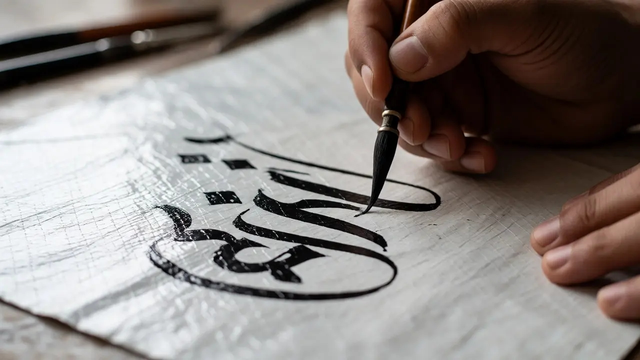
You’ve probably seen those stunning photos of kite calligraphy soaring against a blue sky. It looks effortless, doesn’t it? Like the wind itself is writing poetry across the clouds. But here’s the truth: getting that crisp, flowing script onto a fluttering sail isn’t just about having a steady hand. It’s about understanding how materials react to tension, light, and movement. If you’re trying to turn a simple diamond-shaped toy into a piece of aerial art, you need to know more than just how to hold a brush.
This guide breaks down exactly how to execute beautiful lettering styles on both traditional paper sails and modern fabric sails. We’ll cover the specific inks that won’t bleed, the techniques for keeping lines sharp when the kite twists in the breeze, and how to design your layout so it reads correctly from the ground. Whether you are a seasoned flyer or a beginner crafter, these practical steps will help you avoid the common pitfalls that ruin most first attempts.
Choosing Your Canvas: Paper vs. Fabric
The biggest decision you make before picking up a pen is what material you’re working with. This choice dictates everything else-your ink, your tools, and even how you launch the kite. Most beginners start with paper because it’s cheap and forgiving. But if you want durability and vibrant colors that pop in sunlight, fabric is the way to go.
Tyvek has become the gold standard for serious kite makers. Unlike traditional tissue paper, Tyvek is a synthetic material that resists tearing and water damage. You can write on it with permanent markers, and it won’t crinkle when you fold it up for storage. However, it’s slippery. Getting smooth, consistent strokes requires a different touch than writing on matte paper.
Fabric sails, typically made from ripstop nylon or polyester, offer a different challenge. The surface is often coated to prevent air permeability, which means regular acrylic paints sit on top rather than soaking in. They crack when the fabric stretches. To get good results on fabric, you need specialized textile mediums or heat-transfer vinyl. Let’s look at how these materials stack up against each other.
| Material | Best For | Ink/Paint Compatibility | Durability | Difficulty Level |
|---|---|---|---|---|
| Tissue Paper | Single-use practice | Watercolors, thin India ink | Low (tears easily) | Beginner |
| Tyvek | Lightweight flyers | Permanent markers, oil pastels | Medium-High | Intermediate |
| Ripstop Nylon | Performance kites | Textile paint, Heat Transfer Vinyl | High | Advanced |
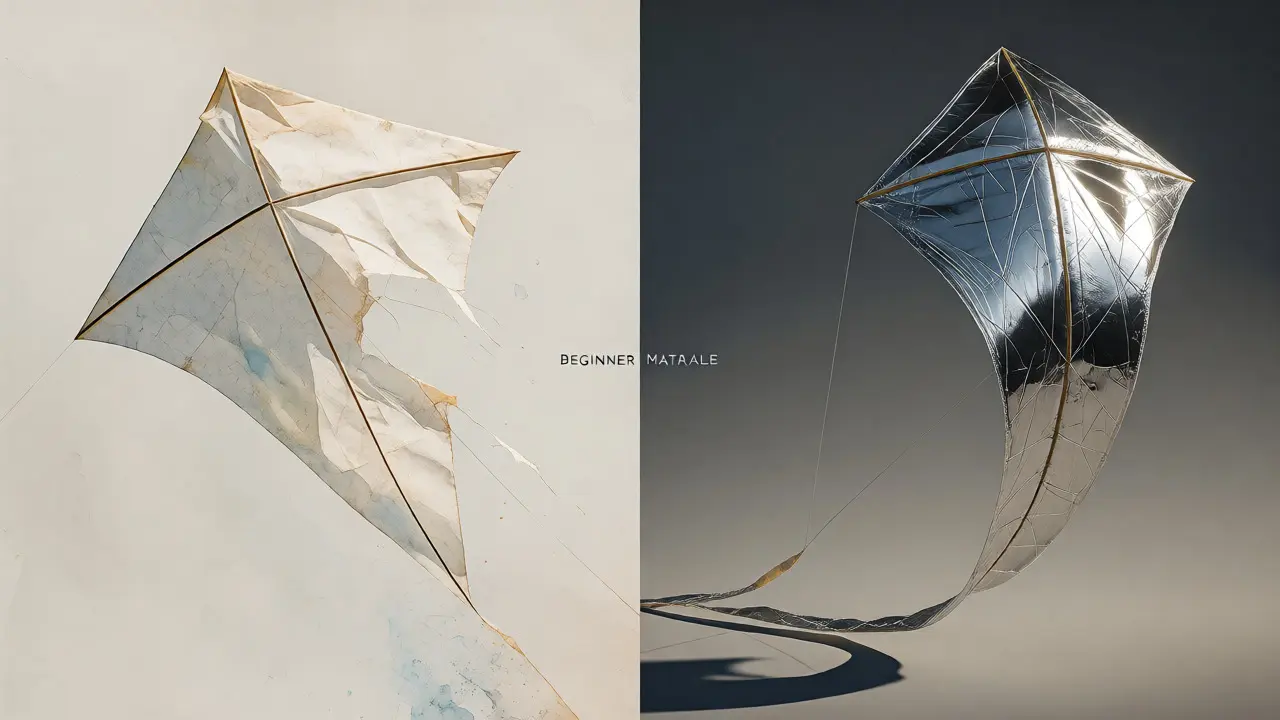
| Mylar Film | Reflective effects | Sharpies, metallic pens | Medium (crinkles) | Intermediate |
Selecting the Right Tools for Aerial Lettering
Standard fountain pens are a disaster waiting to happen on a kite. Gravity works differently when your canvas is vertical or horizontal depending on the wind angle. Plus, wet ink takes too long to dry on non-porous surfaces like Mylar or coated nylon. By the time you’re ready to fly, you’ll have smudged messes everywhere.
For paper sails, stick to high-flow India ink or alcohol-based markers like Copic or Sharpie. These dry instantly and resist fading from UV exposure. If you prefer the look of traditional brushwork, use a dip pen with waterproof sumi ink. Just be sure to let it cure for at least an hour before handling the kite frame.
When working with fabric, skip the liquid paints unless you plan to iron them out later. Instead, consider using heat transfer vinyl (HTV). You cut your calligraphy designs using a machine like a Cricut or Silhouette, weed out the excess, and press it onto the sail. This method gives you razor-sharp edges and ensures the letters won’t peel off during flight. It’s less "hand-drawn" feeling, but it’s incredibly reliable for complex scripts.
Techniques for Keeping Lines Sharp
Here is where many hobbyists fail: they design their lettering as if it’s going to hang flat on a wall. But a kite billows. It curves. It twists. If you draw straight, parallel lines, they will warp and distort once the kite catches the wind. You need to account for this distortion.
Try the "tension test." Before finalizing your design, stretch your sail material slightly over a frame or between two hands. Look at how the grid lines curve. Adjust your letter spacing and baseline accordingly. Often, you’ll find that you need to widen the gaps between letters to compensate for the fabric pulling together under load.
Another trick is to work backward. Since you view the kite from below, mirror-image issues rarely matter unless you’re using text that needs to be readable from above (which is rare). However, symmetry matters. If your design is off-center by even a few millimeters, the kite might spin unevenly. Use a lightweight pencil or chalk marker to sketch guidelines directly on the material. On dark fabrics, white chalk pencils work best; on light papers, use a faint graphite pencil.

Designing for Visibility from the Ground
Remember, nobody sees your calligraphy up close. They see it from fifty feet away, squinting against the sun. Delicate hairlines disappear completely. If you spend three hours crafting intricate copperplate script with fine flourishes, you might not see any of it once it’s airborne.
Bold, thick strokes win every time. Think block letters or heavy-weight brush script. Contrast is your best friend. Black ink on white paper is classic, but don’t be afraid of color. Yellow ink on navy blue fabric pops violently against the sky. White ink on black Mylar creates a sleek, modern look. Avoid pastel colors-they wash out in bright daylight.
Keep your message short. "Love," "Peace," or a single large initial works better than a full sentence. If you must use a phrase, break it into two lines max. More than that, and the viewer’s eye gets lost tracking the words across the moving sail.
Common Pitfalls and How to Fix Them
Smudging is the number one enemy. If you’re using wet media, do not rush the drying process. Place your finished sail in a warm, dry area for several hours. Humidity slows down drying significantly, so check the weather forecast. If it’s raining tomorrow, don’t start painting today.
Another issue is weight distribution. Adding layers of paint or multiple stickers changes the center of gravity. If you’re adding heavy decorative elements, balance them carefully. A lopsided kite flies poorly and tangles its tail. Test your kite indoors first. Throw it gently across the room. If it spins wildly or dives, your design might be too heavy on one side.
Finally, don’t forget the tail. While not part of the calligraphy, the tail affects how the sail presents itself to the viewer. A long, flowing tail can distract from the lettering if it crosses the face of the kite. Position your text centrally or slightly higher to keep it clear of the tail’s path.
Quick Checklist for Your First Project
- Choose a durable material like Tyvek or ripstop nylon for your first attempt.
- Use fast-drying, waterproof ink or heat-transfer vinyl.
- Sketch guidelines lightly before committing to permanent marks.
- Test your design under slight tension to anticipate warping.
- Opt for bold strokes and high-contrast colors for visibility.
- Allow ample drying/curing time before assembly.
- Check weight balance by indoor throwing tests.
Frequently Asked Questions
Can I use regular acrylic paint on a kite?
Regular acrylic paint tends to crack and peel when applied to flexible kite materials like nylon or plastic film because it dries hard and brittle. It’s best to use paints specifically formulated for textiles or mix acrylics with a flexible medium. For paper kites, diluted watercolors or thin acrylics work well since the paper absorbs the pigment.
What is the best ink for Tyvek kites?
Alcohol-based markers, such as Sharpie Fine Point or Copic Sketch, are ideal for Tyvek. They adhere well to the synthetic surface and dry quickly without smudging. Oil-based paint pens also work but require longer drying times. Avoid water-based inks as they bead up and wipe off easily.
How do I prevent my lettering from warping?
Warping occurs when the fabric stretches unevenly. To minimize this, apply your design while the material is under slight, even tension. You can tape the edges of your sail to a board while drawing. Additionally, keep your design centered and symmetrical to ensure balanced stress distribution during flight.
Is kite calligraphy suitable for beginners?
Yes, but start simple. Begin with pre-made kite kits made of Tyvek or paper. Practice your lettering on scrap pieces of the same material before attempting the actual sail. Using stencils or printed templates can help you get comfortable with the scale and spacing before you try freehand.
Do I need to seal my calligraphy?
Sealing depends on the material and ink. Tyvek and paper usually don’t need sealing if you use permanent markers. Fabric kites painted with textile paints may benefit from a clear spray fixative to protect against rain and UV fading. Always test the sealer on a scrap piece first to ensure it doesn’t dissolve your ink.